Designing for accessibility has been an increasing priority in the digital marketplace for years. Built on incorporating outside perspectives on universal inclusivity, accessibility is an ongoing discussion between designers and their clients. And, from our perspective, that conversation is over.
Don’t misunderstand our meaning. Approachable, equitable design that considers the needs of every user isn’t just a path toward stronger, more inventive work. It’s simply the right thing to do. And that’s why we’re no longer putting accessibility design on the table for discussion in client meetings at We The Collective. It’s built into our process from the beginning.
Brands and marketing teams looking to hire agencies shouldn’t have to ask about user interface accessibility. It should be a given that every digital project has taken into account all users, including those with needs different from our own.
The digital marketplace has already shown an ability to adopt new standards to satisfy different platforms and expectations. It’s time to stop talking about accessibility design so we can get on with creating work that offers a better experience for everybody.
The adoption of digital accessibility standards mirrors responsive design
What we’re calling accessibility in design serves as a continuation of the movement toward responsive design in the mid '00s. Obviously, the longtime struggles of the disabled community far outweigh the inconvenience of users who visited a website that looked bad on their phone. But there are shared principles at work in ensuring an equitable online experience.
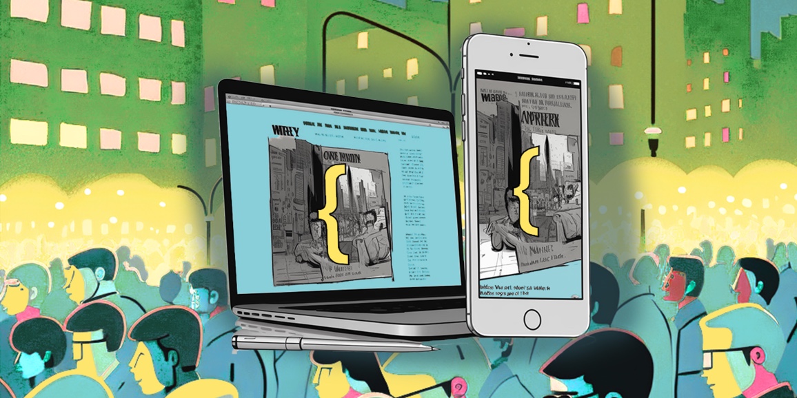
Ten years ago, designers and brands had to reckon with a changed reality as mobile device use increased. Back then, your screen size was a restriction on your ability to shop, read the news, and have a the same user experience as someone viewing a site on a desktop or notebook.
At first, the idea that designers must allow for these additional use cases was unthinkable. This meant the creation of multiple, independent websites to suit different devices and deliver separate experiences. But as approaches evolved, fluid layouts and adaptive content became the industry standard. These responsive design methods became so expected that just five years later, Google began prioritizing the search rankings for sites that accommodated this new standard.
Brands should think the same way about accessibility design. You should expect your agency to automatically account for inclusivity just as it's now assumed every website offers a comparable experience on all devices.
And while too much of the internet is still not accessible for users with disabilities or other sensitivities, it would be naïve to discount the idea that Google will one day implement a policy akin to its view of responsive design. Sites are already beginning to receive higher rankings for properly using semantic HTML for a more inclusive experience.
Don’t think of this response as a penalty; think of it as a reward for those websites that make the Internet a better place.
Designing for accessibility generates stronger work
Just as responsive design was at first met with resistance, some in the industry still view accessibility design as an additional layer of work or a restriction on creativity. Since we began incorporating accessibility into our design process for every kickoff meeting and concept presentation with our clients, this has not been our experience.
For all of the concerns some may raise about the limitations of accessibility design, We The Collective has yet to come across a project we couldn’t make accessible to all users, even when retrofitting old websites. But this would not have been possible on our own.
In the early stages of learning how to design more inclusive products, we conducted research and experimentation that established our footing with some best practices. We also partnered with Knowbility, which provided a vital connection to the community and the ongoing conversations about accessibility. Through trial and error, we found a process that allows us to continue building fun and interactive designs that are available to every audience.
In the process, our clients enjoyed a better return on their investment. They know the digital “community” their projects provided made all users feel welcome.

The far-reaching benefits of accessibility design outweigh the costs
When brands consider designing for accessibility, fear is often a motivating factor. Certainly, being sued when your product is found to discriminate against those with disabilities is much more expensive to resolve. But avoiding punishment should not be seen as the top priority.
For us, adopting an inclusive perspective of our work is just the right thing to do. In addition to incorporating accessibility into our design process, we also do code reviews during development to ensure the results are usable by all audiences. Our commitment is ingrained into our workflow and reflected in our GitHub, where we’ve shared open source accessible code for a plethora of common web design patterns.
The more the designer community can collaborate with one another and share what we have learned about inclusivity, the faster this approach becomes the industry standard.
Accessibility is the next step in the evolution of the web
In 2020, designing for accessibility shouldn’t be seen as an additional consideration for agencies or their clients. It should already be understood as the best practice.
When done properly, the design choices that come from a more inclusive approach benefit everyone. Think of the experience of using the tab key to progress through forms, which was developed as an allowance for visually impaired website users. Now, forms that don’t use that keyboard shortcut feel frustrating.
At We the Collective, we’re committed to building intuitive and inventive experiences that satisfy the needs of every audience. Contact us if you feel the same way.


